- Published on
DS 4100 Day 15
- Authors

- Name
- Jacob Aronoff
DS 4100 Data Collection, Integration, and Analysis
Today we're continuing our lesson on statistics.
Statistical Inference
Statistical inference combines the methods of descriptive statistics with the theory of probability to infer characteristics of a large population from small sample. The sample must be selected randomly and must be “large enough” to be statistically significant.
Statistical Significance
Statistical significance means that the characteristics of the sample are likely not due to chance or random error. Significance is expressed by a probability. In most sciences, a confidence level of 95% is generally accepted as statistically significant, i.e., we accept a 5% probability of being wrong about our conclusion.
Population vs. Sample
A sample is a small set of randomly selected representatives from a larger population. When it is impossible (or very difficult) to measure a population, then select a sample.
Standard Error
The standard error of a sample is a measure of the sampling error and can be used to estimate the standard deviation of a population:
SE = deviation / sqrt(n-1)
where n is the sample size, i.e., the number of representative elements.
Random Sample
Samples must be drawn randomly which means that each element of the population has the same probability of being included in the sample. Random samples are often drawn through random events, such as assigning numeric identifiers to each element and selecting a set of random numbers through a computer or a random number table.
Concept of Correlation
A correlation is a relationship between two variables in which one variable changes in a quantifiable way with another.
For example, there are correlations between:
- Weight and cholesterol level
- Task completion time and task complexity
- Salary and years of education
Consider the following:
In the late 1940s, before there was a polio vaccine, public health experts in America noted that polio cases increased in step with the consumption of ice cream and soft drinks. Eliminating such treats was even recommended as part of an anti-polio diet. It turned out that polio outbreaks were most common in the hot months of summer, when people naturally ate more ice cream, showing only an association or correlation.
So, does eating ice cream or hot weather cause polio?
Detecting and Measuring Correlation
Correlation is most easily detected through exploratory visualization with a scatter plot.
The strength or degree of correlation is measured by the coefficient of correlation, R.
The value of R ranges from -1 to +1.
Positive: as one variable increases, the other increases as well
Negative: as one variable increases, the other decreases
Once a correlation has been established, the relationship can be mathematically quantified in a formula through regression analysis:
Linear regression: line
Non-linear regression: curve
Pearson Moment Coefficient R
Recall that the value of R is between -1 and +1.
An absolute value close to 1 is a strong correlation, whereas a value close to 0 indicates little to no correlation.
Values above 0.6 are generally considered to be useful, while values above 0.9 are indications of strong correlations.
Assessing Correlation
- Identify the pairs of values to be tested for correlation
- Create a scatter plot of the data
- Visually inspect the clustering and trending of the data to determine if there is potential for correlation
- Calculate the Pearson Moment coefficient of correlation, R
- Evaluate R
Assumption of Normality
The Pearson Moment coefficient of correlation (R) assumes that the data is normally distributed.
When data is not normally distributed or when the presence of outliers gives a distorted picture of the association between two random variables, the Spearman’s rank correlation is a non-parametric test that can be used instead of the Pearson’s correlation coefficient.
The Spearman’s rank correlation (also called Spearman’s rho ρ) is the Pearson’s correlation coefficient on the ranks of the data.
Determining Normality
Data that is normally distributed would exhibit a “bell curve” distribution with most values around the mean and fewer values on each tail.
Normality can be determined in several ways:
perform the Shapiro-Wilk test
build a Q-Q plot
visually inspect histogram
Pearson’s and Spearman’s Correlations
To calculate Spearman’s rho, we need to determine the rank for each of the IQ scores and each of the Rock scores, e.g., the rank of the first IQ score (cell A4) is =RANK.AVG(A4,A13,1).
Next calculate both correlation coefficients as follows: Pearson’s =CORREL(A4:A13,B4:B13) = -0.036 Spearman’s =CORREL(C4:C13,D4:D13) = -0.115
Result: there is no significant correlation between IQ and listening to rock music based on the sample.
Correlation in the Presence of Outliers
- Outliers can affect the calculation of correlation, so plot the data in a scatter plot or histogram to determine if there are outliers.
- Calculate the Pearson’s correlation coefficient for the sample with and without the outliers. If there isn’t much difference, then the outliers are not influencing the results.
- Calculate the Spearman’s rank coefficient. If it is close to the Pearson’s correlation coefficient, it is also a good indicator that the outliers are not substantially influencing the results.
- If there are clear differences then you will need to determine how you treat the outliers, i.e., whether to remove them.
Summary
- Correlation is an important data analysis tool
- The strength of a correlation is expressed with the coefficient of correlation, R
- Correlations can be positive or negative
- Correlation does not equate to causation
- Use the Pearson Moment correlation if the data does not have outliers and is reasonably normally distributed, otherwise use the Spearman Rank correlation
Predictive Analytics
Predictive analytics is an area of data mining that deals with extracting information from data and using it to predict trends and behavior patterns. Often the unknown event of interest is in the future, but predictive analytics can be applied to any type of unknown whether it be in the past, present or future.
Another definition:
Predictive analytics is the practice of extracting information from existing data sets in order to determine patterns and predict future outcomes and trends. Predictive analytics does not tell you what will happen in the future. Predictive analytics is largely focused on forecasting under risk where different outcome scenarios occur at differing probabilities.
Forecasting
Forecasting of demand, storage growth, resources, network traffic, orders, and so forth is a key responsibility of an information scientist.
There are four general approaches:
- Time-Series Models
- Causal Models
- Qualitative Models
- Monte-Carlo Simulation
Qualitative Models
- Single and Wide-Band Delphi
- Expert Judgment
- Bottom-Up Composite
- Stakeholder Survey
Time-Series Models
- Moving Average
- Exponential Smoothing
- Trend Projection
Causal Models
- Linear Regression
- Multiple Regression
- Non-Linear Regression
Qualitative Models
Qualitative models incorporate expert opinions and subjective factors. Useful when subjective factors are thought to be important or when accurate quantitative data is difficult to obtain. Common qualitative techniques are
- Delphi (single and wideband)
- Expert Judgment
- Bottom-Up Composite
- Stakeholder Survey
Time-Series Models
Time-series models attempt to predict growth based on historical data. Common time-series models are
- Moving average
- Exponential smoothing
- Trend projections
Causal Models
Causal models take other factors into account and are often more accurate. The objective is to build a model with the best statistical relationship between the variable being forecast and the independent variables. Regression analysis is the most common technique used in causal modeling.
Moving Average
Moving averages work best when the data does not contain any trend or cyclic patterns. The forecast is the average of the most recent n data values, Yt.
This method tends to smooth out short-term irregularities in the data series.
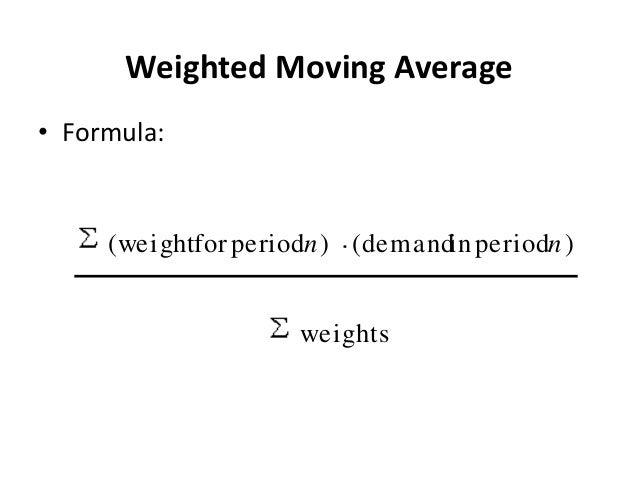
Weighted Moving Average
Weighted moving averages use weights to put more emphasis on recent periods Often used when there is slow growth.
Selecting Weights
Start with equal weights (standard moving average) and then put progressively more weight on the most recent data if there’s growth. Exponential smoothing is best if there’s more emphasis on recent data. Regression trend models are better when there are growth or cycles.
Exponential Smoothing
The smoothing constant (α) is the percentage by which the forecast takes into account the most recent data point.
F_t+1 = F_t + α(Y_t-F_t)
Start with a smoothing constant α = 0.3 and then adjust the model. Bootstrap the model by using the first data point as the forecast for the first time period.
Holt’s Method
Holt’s Method adds a trend component to exponential smoothing to produce a second-order model.
FwT_t+1 = F_t+T_t FwT_t+1 = F_t+(1-β)T_t-1+β(F_t-F_t-1)
High values for β makes the model more responsive to recent changes in trend.